Newsletter Subscribe
Enter your email address below and subscribe to our newsletter

 ByJohn A
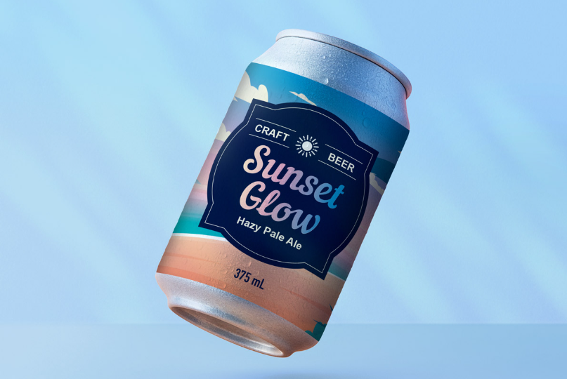
Nothing undoes a nice bit of packaging faster than a label that has gone soft at the corners. Chilled drinks do it, shower products do it, and the culprit is almost always the material rather than the design. A waterproof label would have handled the same conditions without flinching.
Plenty of brands pick a stock because it suits the artwork, then discover the product lives somewhere damp. A waterproof label keeps packaging looking tidy through condensation, splashes and constant handling, which protects the money already spent on branding. The design was never the weak point. The paper underneath it was.
Why Fridge Doors Are Hard on Labels: Chilled products collect moisture every single time they move between cold storage and room temperature. That cycle repeats daily in a shop fridge, and plain paper absorbs a little water each round. Edges lift first, then the printed surface softens, and the whole thing starts looking older than the product inside it.
Bathroom Shelves and the Splash Problem: Bathroom products face steam rather than condensation, which is slower but just as damaging. In everyday production work, printers routinely see cosmetic brands return with the same complaint, which is that labels looked perfect for a month then went wrinkly once customers started using the product daily. Steam gets everywhere.
What Ignoring It Costs Down the Line: Postponing a material change narrows your options and raises the cost of fixing it. Stock already printed on the wrong paper cannot be rescued, so the choice becomes relabelling by hand or living with the look until the batch runs out. Neither feels good on a retail shelf.
Choosing for Looks Alone Backfires Quietly: Selecting a label material purely on appearance ignores the conditions the product actually faces after it leaves you. Uncoated stock photographs beautifully and feels lovely in the hand, though it absorbs moisture readily. Consumer perception forms at the shelf, and a tired label sends a message the brand never intended to send.
Matching Material to the Real Environment: The practical approach starts with where the product lives rather than how the label looks flat on a desk. Fridge, bathroom, cool room, handbag, ice bucket, each one makes different demands. Deciding that first narrows the material choice sensibly, and the design work then happens within options that will actually survive.
Water Sits on It Instead of Soaking In: Polypropylene is a synthetic film that does not absorb moisture, so condensation beads on the surface and wipes off cleanly. There is no fibre to swell, which removes the wrinkling problem entirely. A waterproof label built on this stock stays flat through repeated chilling and handling.
Tearing, Scuffing and General Rough Treatment: Synthetic film also resists tearing and scuffing far better than paper, which matters once products start moving through crates and delivery runs. Good supply chain handling still involves knocks, and a label that survives transport arrives looking the way you approved it. Laminate on top adds another layer of protection.
Where Paper Still Does a Decent Job: Paper labels remain a sensible, cost-effective choice for dry goods stored at room temperature. Spices, biscuits, pantry items and gift packaging all sit comfortably on laminated paper, and the price difference adds up across a large run. Certain paper stocks built for wine labelling also cope well with moderate moisture.
Where Synthetic Earns the Extra Spend: Synthetic becomes the better buy as soon as moisture is part of normal use. The upfront cost is slightly higher per label, offset by not reprinting mid season. A waterproof label on a chilled drink or a shampoo bottle holds its finish for the life of the product.
See Also: Crown Lengthening Surgery: Steps, Healing, and What to Expect
The Glue Matters as Much as the Face Stock: Adhesive choice determines whether a label stays put on a damp or cold surface. Standard adhesives lose grip on containers that go straight into refrigeration, which is why chilled products need a stock designed for that. The face material can be perfect and still lift if the glue underneath is wrong.
Curves, Textures and Awkward Containers: Application surface affects performance more than people expect. Tight curves pull at the edges of a stiff label, textured plastics reduce contact area, and a freshly washed container traps moisture beneath the adhesive. Checking the actual container before ordering saves a great deal of annoyance later on.
The Check That Prevents a Soggy Surprise: Most damp label problems come down to one assumption made early and never tested. Choosing a waterproof label properly means confirming a short list of practical details before artwork goes to print. Worth a few minutes now rather than an awkward conversation with a stockist in three months.
Labels that suit their environment keep doing their job quietly, which is exactly what good packaging should do. Leave the material decision too late and the fix becomes expensive, because printed stock cannot be undone. Check your storage conditions, request a sample on your own container, then confirm the material before your next run.